Blue Angels
Markets
Reading Yardeni’s Infamous Blue Angels Charts
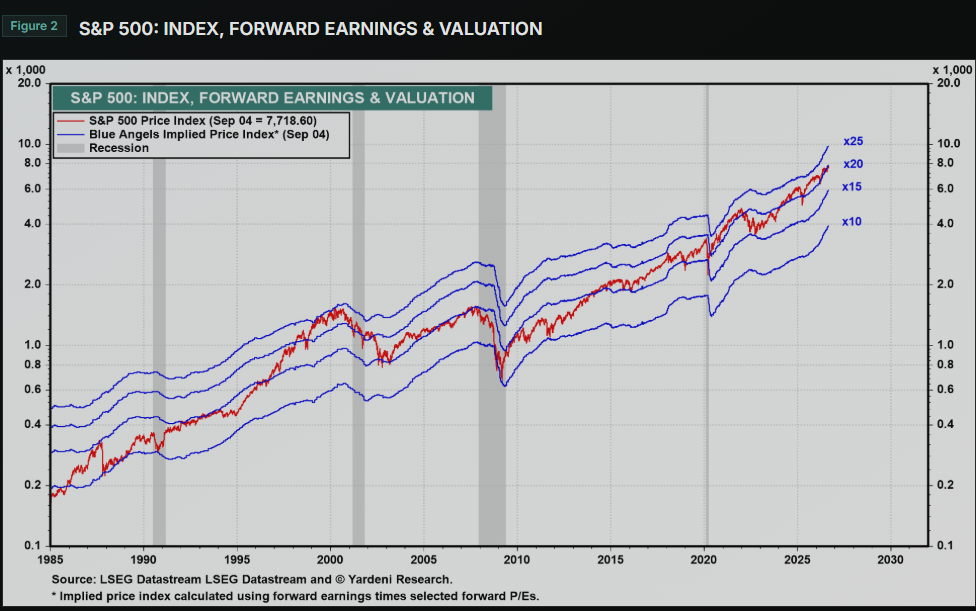
Ed Yardeni’s Blue Angel charts are a staple for any equity investor/strategist
TipQuestion
Q: What does the Blue Line with x10 mean?
NoteAnswer
A:
- Consider the tautology: \(\frac{P}{E}\times E = P\)
- Since asset are priced prospectively, that’s actually \(\frac{P_{t}}{E_{t}[EPS_{t+12mths}]}\times E_{t}[EPS_{t+12mths}]\)
- Now, pick a date along the x-axis. Let’s say that’s 4Sep2026
- Take the SP500 Earnings Estimates for the Next Twelve Months (NTM)
- Multiply that a PE of 10
- That provides an SP500 index price implied by the time \(t\) earnings expectations and the multiple of 10.
- From what I can gather, Yardeni chooses the range of multiples to span the actual price index over the time range of the chart.
TipQuestion
Q: Go to Yardeni’s charts for the SP500, SP600, and SP400. Comment on their relative valuations.
NoteAnswer
A:
- Comments as of my 7Sep2026 visit to the Yardeni website
- I’ll compare the valuations for the charts covering 2000 through today
- None of the indices are near their COVID/Dot Com extremes
- Large Caps are modestly closer to their historic peaks (20 vs 25) then small caps (15 vs 20) and mid caps (15 vs 20)